


How to choose between a vertical, horizontal and hourly planner
Before I joined the planner community, I didn’t know what a planner layout was, let alone how to differentiate between them. I just assumed that a planner’s design was a variation of the same general template. A calendar is already organized into the familiar pattern of months and weeks and holidays–shouldn’t that be enough? When it comes down to it, it’s not the cover, or the coil to care about (though these factors are important). It’s the layout that really matters. The layout is the framework of your planner. Your planner layout will influence how you approach each day, week, and month when you sit down to plan.
To summarize, there are five main planner designs, called layouts. There is the daily layout and the monthly layout. I won’t discuss these in depth because they vary little from planner to planner. Suffice it to say that the daily layout gives each day a full page, whereas the monthly layout focuses only on the calendar month. The three to know about are all weekly layouts, in vertical, horizontal, and hourly. Each of these layouts features distinct elements. These elements can be the difference between loving your planner and leaving it behind.
So let’s take some time to understand the layouts and how to use them most effectively.
Vertical Layout
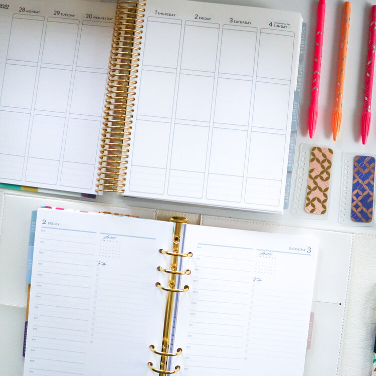
The vertical layout is a weekly planner layout option. Each day of the week is planned vertically, from top to bottom. Days of the week are displayed from left to right across a two-page spread (Monday to Wednesday on the left, Thursday to Sunday on the right). Many planner companies combine Saturday and Sunday together to give each weekday more width. All vertical layouts (and weekly layouts in general) start on Monday and end on Sunday.
The vertical planner is made for those who want freedom and flexibility in their planner with the tiniest bit of structure. If you organize your day by tasks and to-dos, you might prefer the horizontal layout. However, if you prefer to organize by meetings and appointments, you may prefer the vertical layout. I don’t believe in hard-and-fast rules for any layout because, as you’ll see, each layout has pros and cons.
Take the Erin Condren vertical weekly layout, for example, from their signature LifePlanner line. The only features in the vertical layout, aside from dates in the top margin and lined sections in the left and right margins, are three large boxes stacked vertically for each day, and a small lined section at the bottom. There are no vertical or horizontal line breaks, times of day, or quotes or prompts. It’s essentially a collection of symmetrical boxes. For this reason, it takes time to get comfortable with the vertical layout. Once I did, however, I realized how much flexibility it affords you to create your own system for planning. You can even switch your system up from day to day! Here are some ideas to consider if you plan in a vertical layout:
Vertical Layout Ideas
- Break your day into three buckets of time, with a box corresponding to Morning, Afternoon, and Evening. Within each box you could list all of your obligations, appointments, or to-dos. I am a corporate employee working 9 to 5, so this setup means my first two boxes are work-focused, and the third box is for personal tasks and to-dos for Plan With Laur. This isn’t enough room for me. But if you have a lot of work meetings or to-dos, this system could be perfect!
- Another option is to designate an area of life for each box, like Home, Work & Personal. I sometimes use this setup when I have a day that is light on appointments and meetings but heavy on tasks and to-dos. This split is great for weekends, for example, where I don’t have time-based obligations (but a lot to do, nonetheless!)
- If your household is three people, you could allocate a box to each person to keep track of their schedule and top priorities.
- My fiancé uses the vertical weekly layout and breaks his three boxes into his Top 3 priorities for the day, non-negotiable appointments and meetings, and his most important tasks for the day.
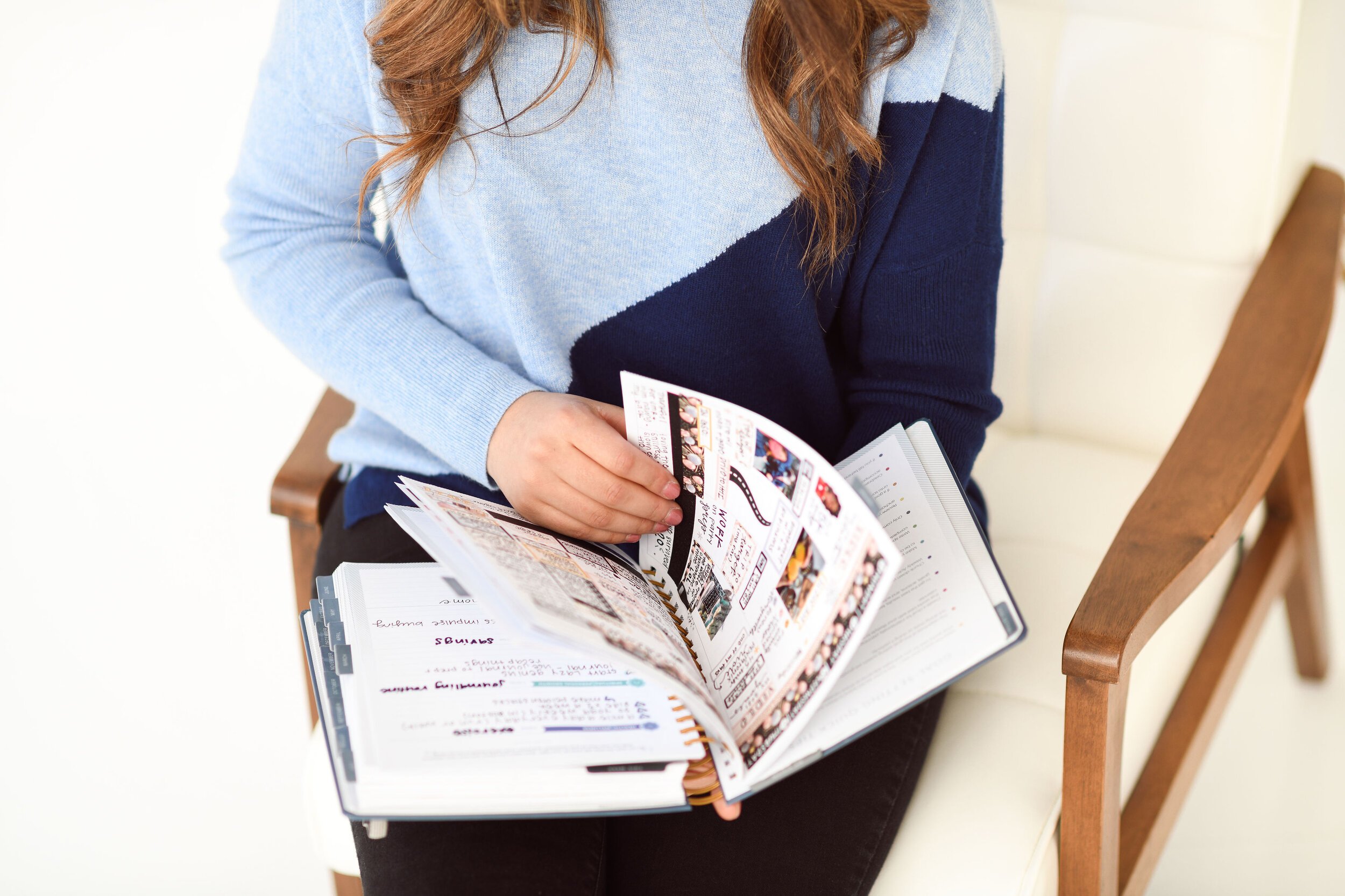
The vertical weekly layout is extremely flexible. Once you find a way of planning that works for you, you will appreciate that the vertical planner doesn’t shoehorn you into a layout that is overly restrictive. If you prefer a decorative planning style with stickers and washi, the vertical planner is blank canvas compared to the hourly and horizontal layouts. A lot of sticker shops size their stickers for the vertical layout. You shouldn’t have trouble finding stickers to fit seamlessly into your layout.
Overall, the vertical planner layout is a favorite in the planner community. It can be overwhelming at first to have such little structure, but the flexibility helps prevent burnout and boredom in your planner. You can always switch up how you plan, depending on your current station in life!
Horizontal Layout
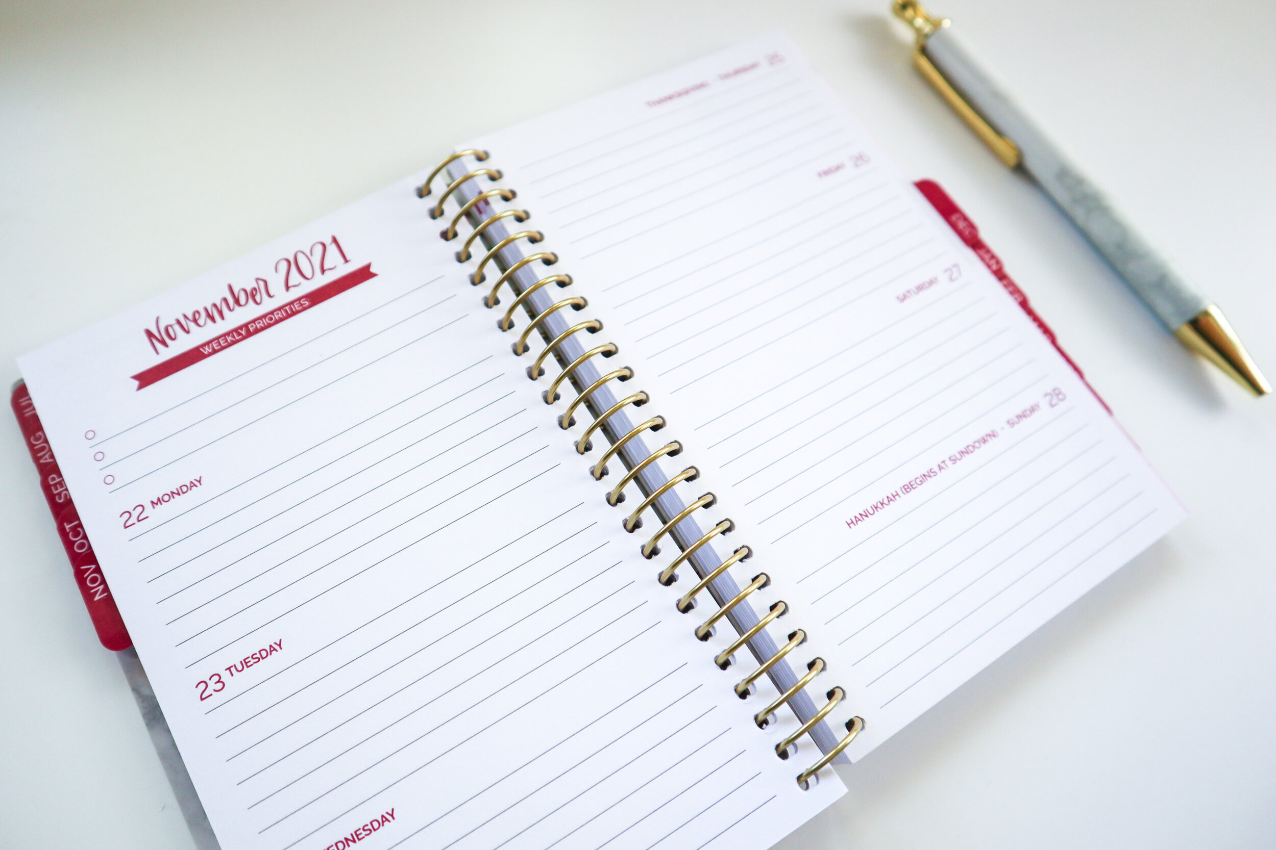
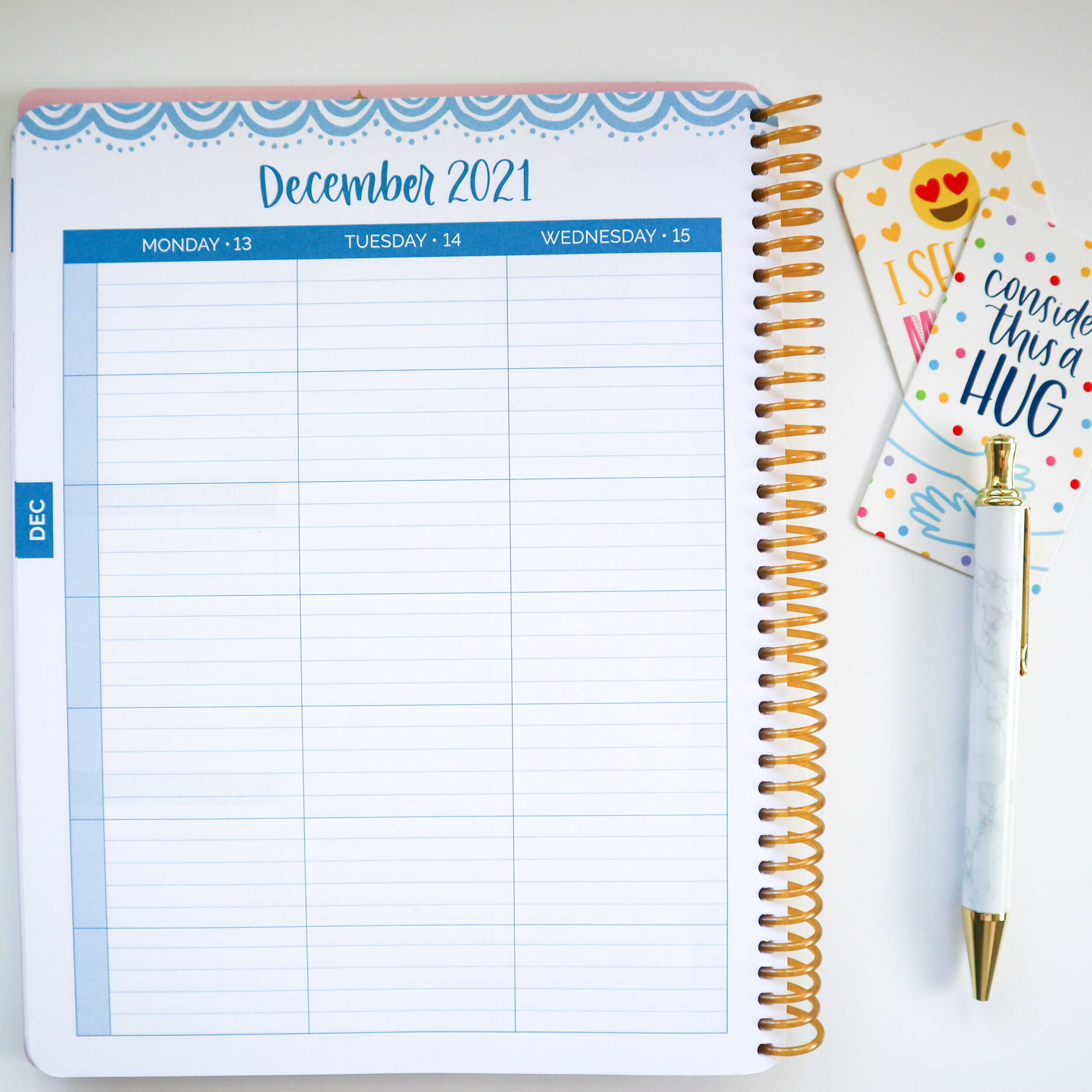
The horizontal layout is a staple layout for nearly all planner brands. You find it everywhere once you know what it looks like. The horizontal layout is the design opposite of the vertical, in that each day is planned horizontally from left to right on the page, with the days of the week stacked top to bottom across a two-page spread. Saturday and Sunday are often combined for symmetry (and because planner companies think we don’t have weekend plans, I guess?!)
The horizontal layout is generally flexible, like the vertical layout. But I’ll say something controversial, in that I think it’s significantly less flexible than the vertical. In many planners the horizontal weekly layout has lines, known as the lined horizontal layout. And the truth is this is either a “love-it” or “hate-it” feature of the horizontal layout. Some people love having lines there for structure; others–myself included–would prefer the open, unstructured boxes you get with the vertical planner layout. Ultimately, the preference is yours. If lines are a “hate-it” feature, you’ll be hard-pressed to find a horizontal layout without them.
I find that the horizontal planner is better for task-oriented people who use their planner to chart and track their progress on tasks and to-dos. If you are someone with fewer scheduled obligations, but more unscheduled “things to do” during your day, the horizontal layout is often a great fit. Here are a few layout possibilities in a horizontal planner:
Horizontal Layout Ideas
- Turn your horizontal planner into a command center for your life’s many to-dos. Planners are a great, central place to collect and focus on the most important priorities and to-dos for your day. The horizontal layout is a built-in to-do list. Use vertical line breaks to create multiple columns, which gives the appearance of distinct categories. If you have “work to-dos” vs. “home to-dos”, this is a great system to accomplish both. You are limited by the number of lines per day–most planners have 6 or 7 horizontal lines per day. If you have a huge to-do list, maybe this wouldn’t work for you.
- Vertical line breaks open other possibilities, too. Some planner brands do this for you by shading the middle portion of each day (this is rare). With line breaks, you decide how many columns to create (two or three is best, four gets a little crowded). Let’s say one day you need two columns, one for meetings and one for to-dos, and the next day it’s three columns, one each for meetings, to-dos, and daily priorities. You decide how to break it up! It’s a really neat idea to maximize the effective space of the horizontal layout. The best versions of this look clean, especially if you sprinkle in a few stickers!
- Another idea for your horizontal layout is how I use mine, for daily gratitude and a brief journaling practice. The horizontal lines are conducive to writing out five “I am” statements, for example, if daily affirmations are your thing. Or you could write a quick paragraph reflection each morning about your goals. Or about anything, really. I use my horizontal planner as part of my evening routine. I journal a paragraph outlining my day, how I’m feeling, and anything worth remembering. Why would you need a planner for this when you could just buy a journal or a notebook?” Maybe you don’t need a planner. I choose the horizontal planner because planners are dated, so it’s a lot easier for me to go back and flip through a week at a time to get an at-a-glance idea for how I was feeling.
The horizontal layout–especially the lined horizontal–isn’t as conducive to using stickers as the vertical layout. Remember, many sticker shops size their stickers for the vertical layout. I’ve seen some gorgeous decorative planner layouts, so it’s completely possible! I personally see the horizontal as more of a functional layout than a decorative one, but your mileage may vary.
Hourly Layout
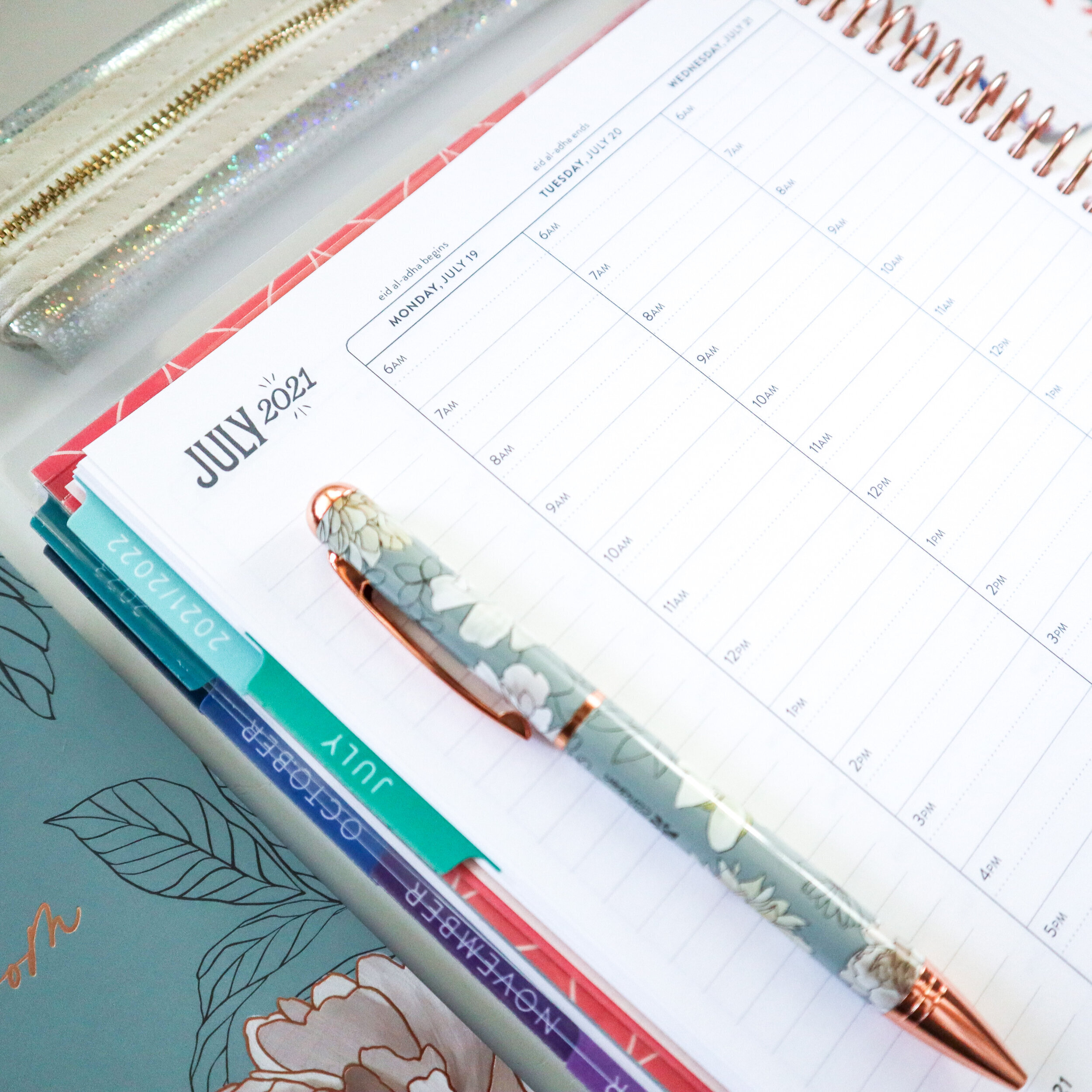
The hourly planner is–you may have guessed it–oriented for those people chiefly motivated by time. It’s for people who want to see the entirety of their day mapped out and attached to specific times. I use an hourly planner, so you can guess what kind of person I am! 🙂 The hourly layout, like the others, showcases an entire week across a two-page spread. Each day is planned vertically, top to bottom, starting on Monday and finishing on Sunday and moving left to right across the page. It’s oriented like a vertical planner in this way.
It’s worth addressing right away: One of the biggest cons with hourly planners is that they never cover the full day (24 hours). Most hourly planners cover somewhere between 12 and 16 hours, depending on the brand.
This feature can be understandably irksome! And though it may seem a minor inconvenience, when you buy an hourly planner you should understand how you’ll use it. For example, some planner companies have hourly layouts starting at 6:00 am and ending at 7:00 pm. Others start at 8:00 am and end later, like at 9:00 pm. Because I’m more of a night owl, I prefer planners that start and end later. Occasionally however, I have a 6:00 am flight to jump on. An hourly layout that starts at 7:00 am loses or chops off my flight.
Another detail to consider is whether the hourly layout includes half-hour blocks or not. These half-hour segments can be helpful, like if you have back-to-back meetings or appointments that start on the half-hour instead of the top of the hour. I use the hourly planner as more of a guide for my day than anything. I don’t go hour by hour, minute by minute, to make sure that every hour is pre-planned with a task assigned. Oftentimes, I have wide swaths of white space – “empty time” – in my schedule. If you don’t like the way this looks, you can use a large sticker to repurpose this unplanned space for a short to-do list.
I love the hourly planner because it is the clearest way to visualize your week and see everything going on at-a-glance. If you are a time-based planner, the hourly layout is better than the daily, I think, for this reason. I can’t tell you how nice it is to sit down once a week with my fiancé and understand the general flow of our week. Friday will be crazy this week, for example, so we’re doing extra preparation on Thursday to then have a less stressful Friday. Hopefully!
Another idea is to use highlighters or different pens to color-code your day by category: Work meetings in red, personal to-dos in blue, your partner’s schedule in green, for example. This tip works for any layout, but I think it’s most effective in the hourly layout because of the symmetry involved; every day starts and ends at the same time. It’s easy to scan visually and think “Wow, a lot of green here–looks like John Michael has a busy week!”
One of the cons of the hourly planner is that, by nature, it forces you to be time-based. If you have a different vision and need for your planner, to make it less about scheduling, for example, and more about goal-setting, an hourly planner wouldn’t work for you. But everyone has things to do, appointments to make, and hectic days to make sense of. I think everyone could benefit from an hourly planner layout.


")